Ancestry DNA Testing
Role: Design, Illustrations, UI Design, High-fidelity prototyping, UX testing interview observer & note-taker
Tools: Sketch, InVision, Photoshop, Illustrator
Overview
Find my past is a company that helps you discover your family ancestry through record search. Forging a new partnership with Living DNA enabled them to offer their customers a DNA testing service to help add an extra dimension to their family history search. A MVP (minimum viable product) site was required to introduce their new product offering.
Research & Discovery
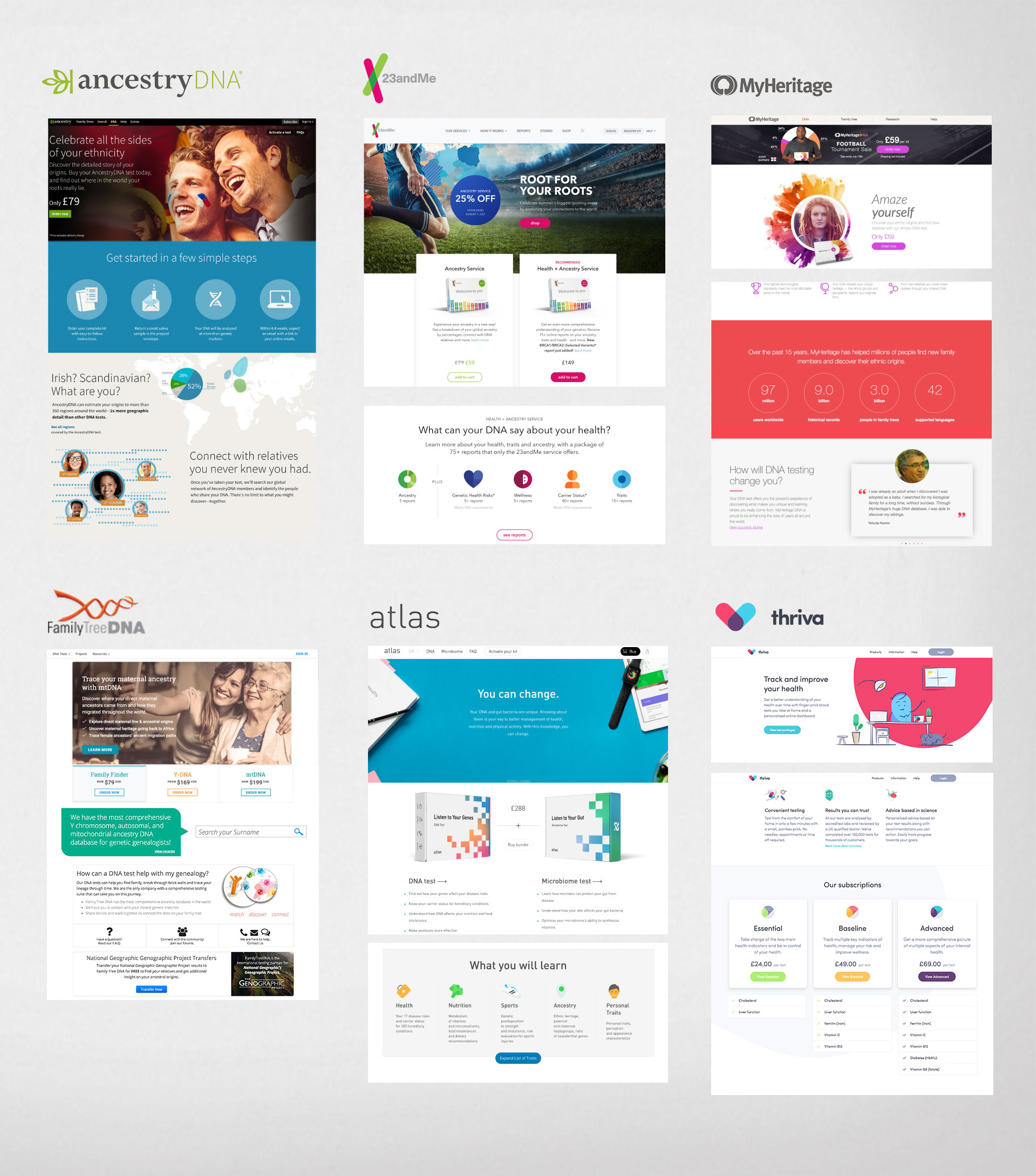
Before putting pen to paper, we performed a competitor analysis of other companies that offer a DNA testing service or a similar product. It was a valuable exercise to discover what the competitors’ tone of voice, content, visual design, user flow and even price points were. We then designed several quick prototypes of our own as a basis for testing our product against a competitor through one-on-one user testing interviews.
Individual User Testing Interviews
The team conducted more than 15 one-on-one 1 hour interviews where we aimed to discover their barriers to taking a DNA test, what they expected out of a test result and what they thought about our site compared to a competitor’s product. We encouraged users to naturally explore the prototype and articulate their thoughts out loud. We watched for non-verbal behaviours and in which areas they struggled with the content or navigation.
Identifying Challenges
We discovered that customers new to the subject of DNA testing were unsure of the process, what results they will gain from taking a test and how this will add value to their family history record search. We also discovered that DNA testing is a complicated area that users often found challenging to digest, with many expressing data privacy concerns as a barrier to entry.
Prototyping & Responsive Design
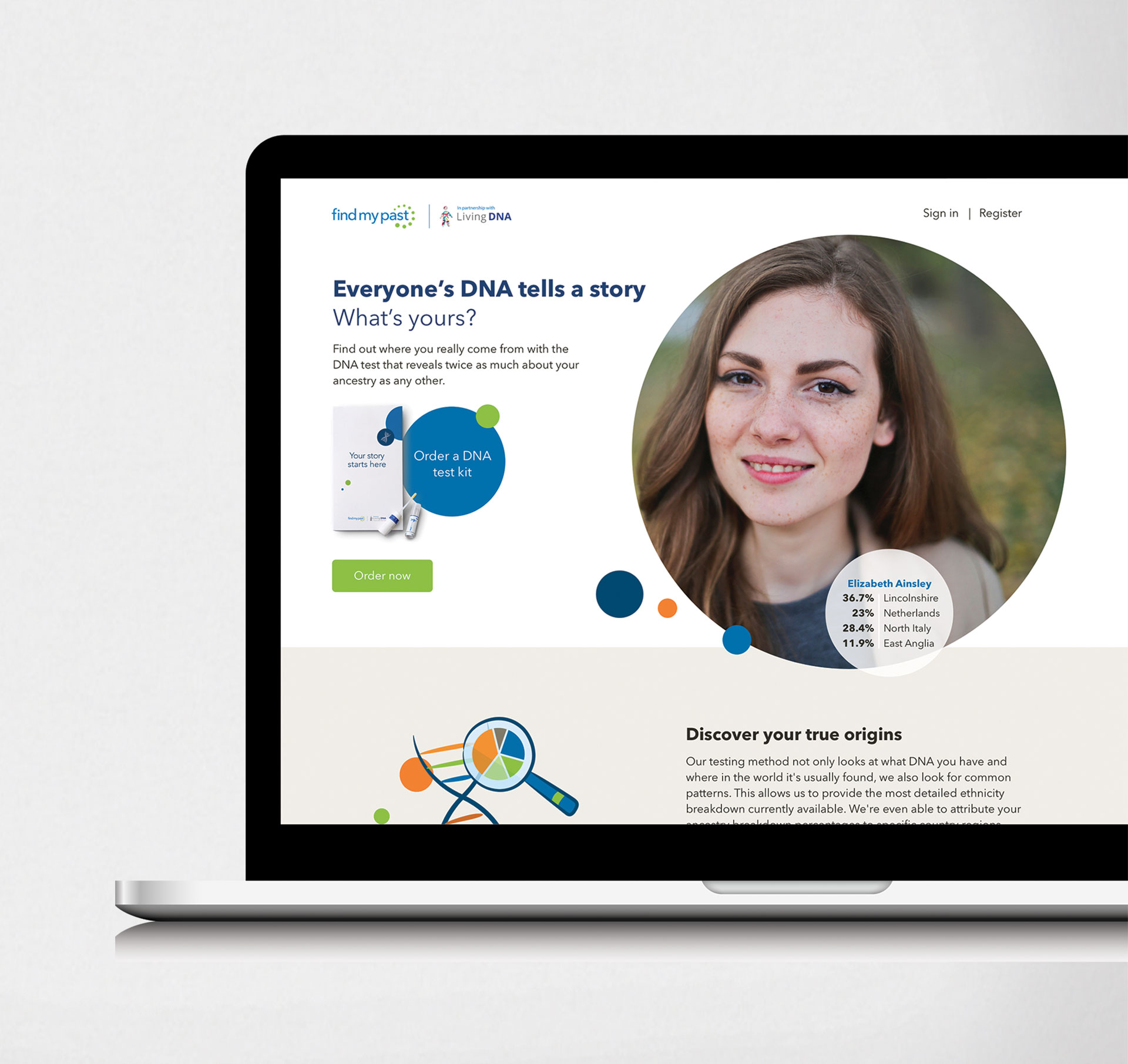
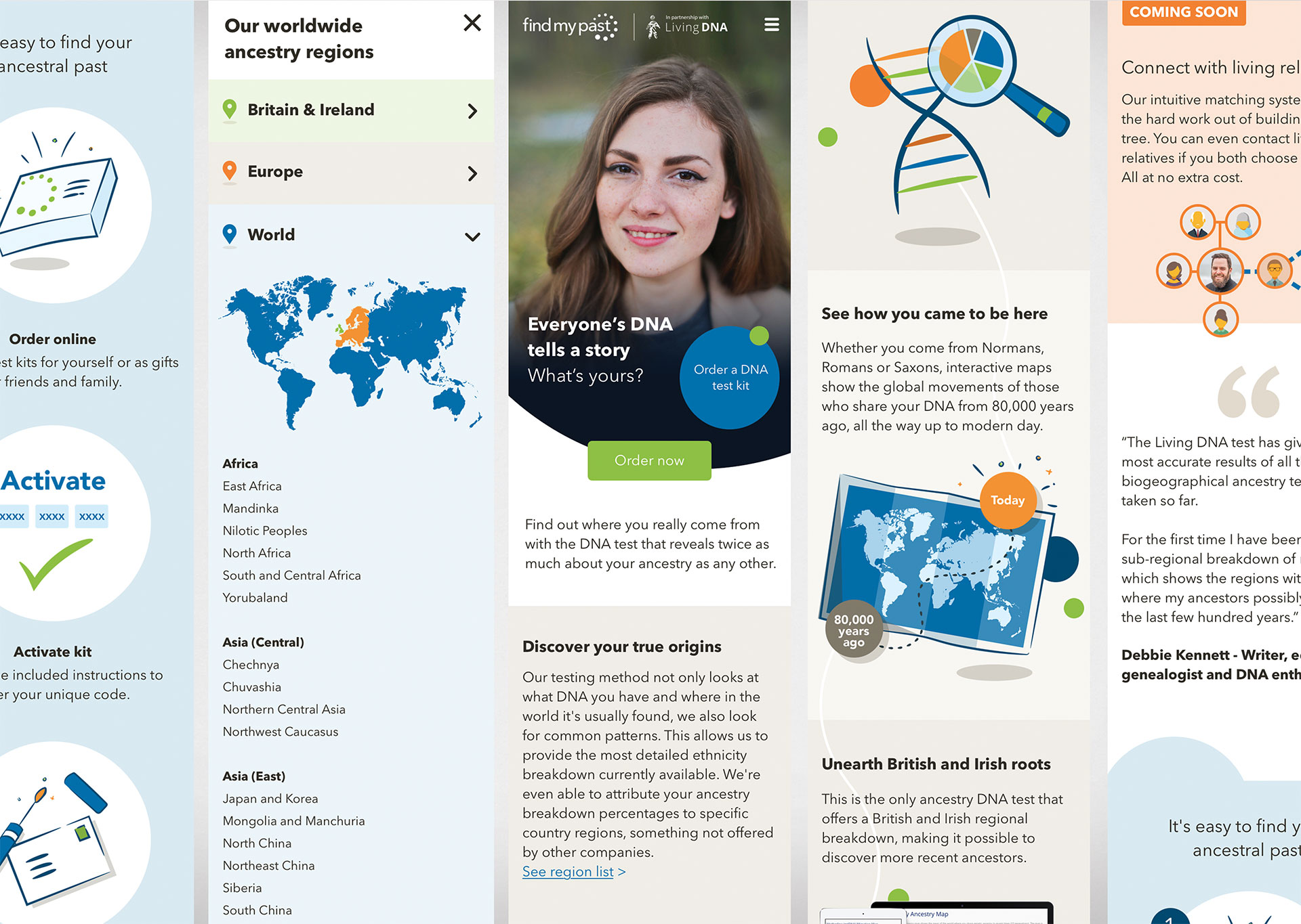
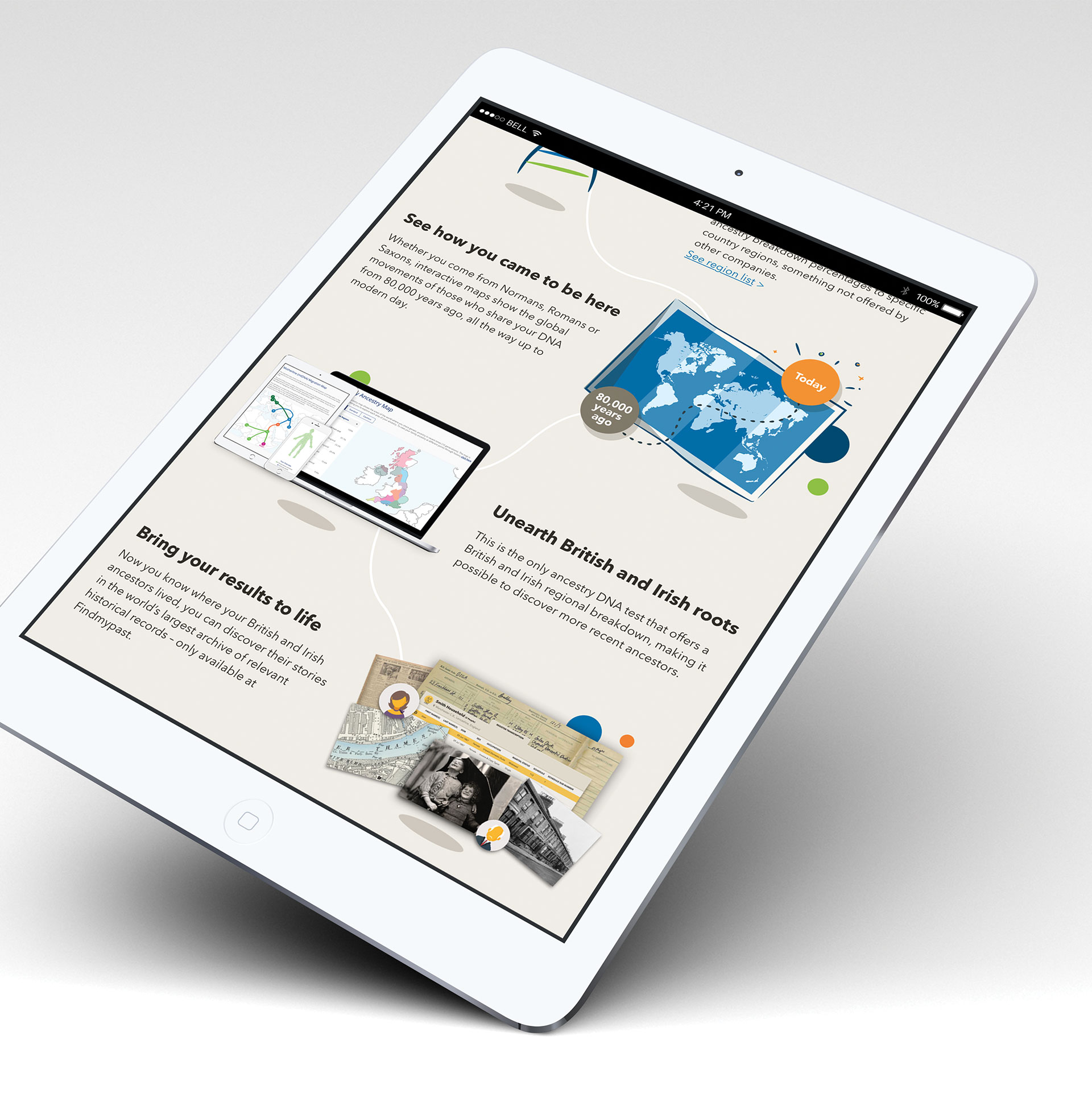
Based on our user interviews, several high-fidelity prototype versions were created with each design further tested with users for their feedback. Several rounds were conducted to validify content and design direction. Designs were responsive across desktop, tablet and mobile and provided a step-change to the company’s overall look and feel.
Product Launch
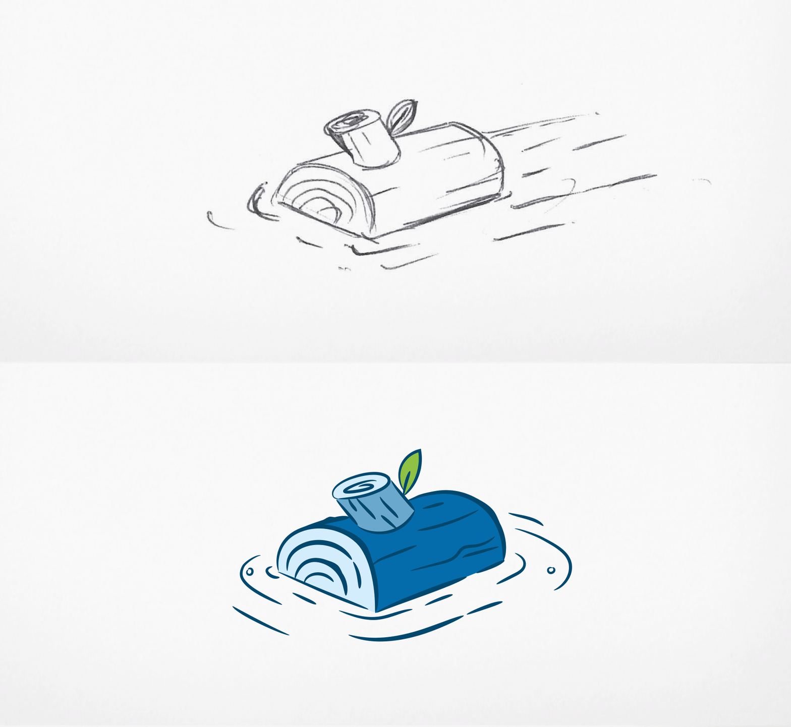
The site launched was a clean and friendly, single page layout that visualised through illustrations what customers can expect from taking a DNA test. It also provided clear steps on how they can take a test and what they will be able to achieve with the results. A big section had also been allocated to addressing data privacy concerns and further queries. As part of an overall effort to bring a more approachable and humanistic feel to the brand, a library of illustrations were designed to help bring the content come to life, adding warmth and personality to what can seem like a clinical product.
What Users Say
All users tested found the site clean and friendly. Data for the first month post-launch displayed initial encouraging results. Average time customers spent on the page was double the average across the entire parent site.
