Marie Curie
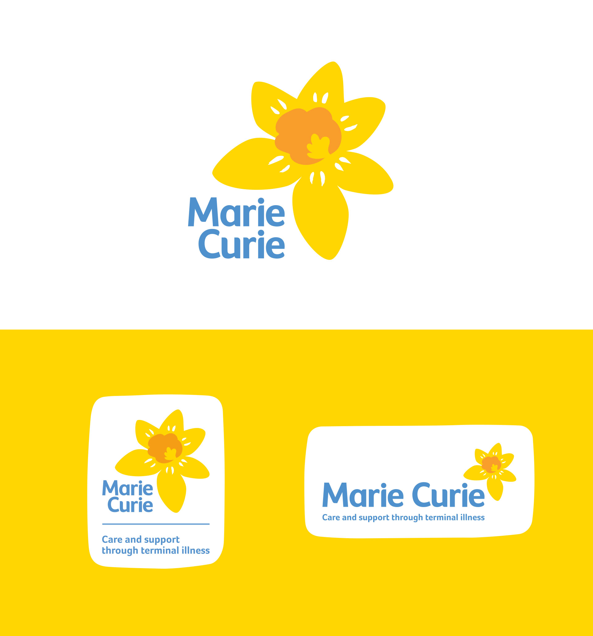
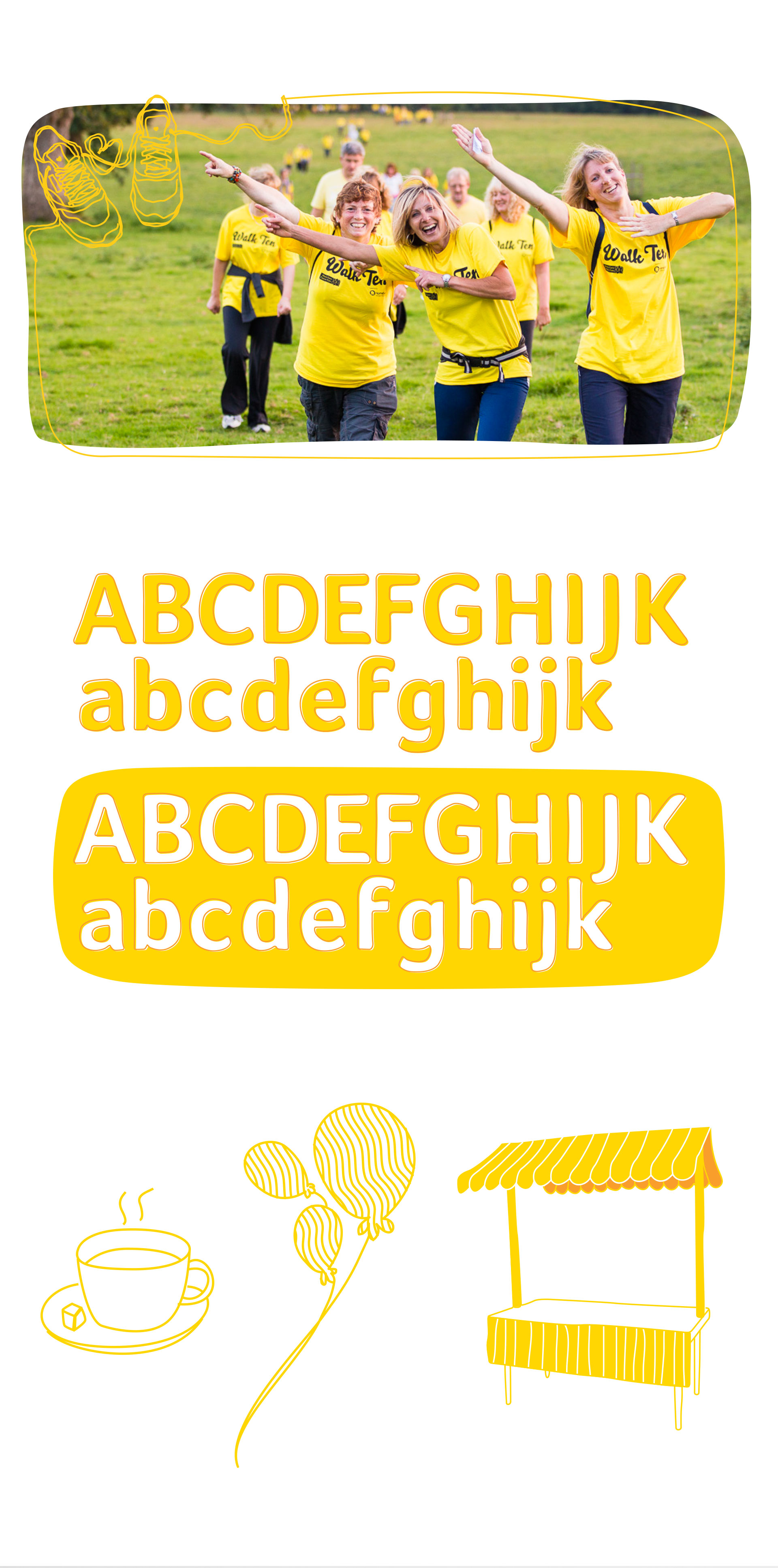
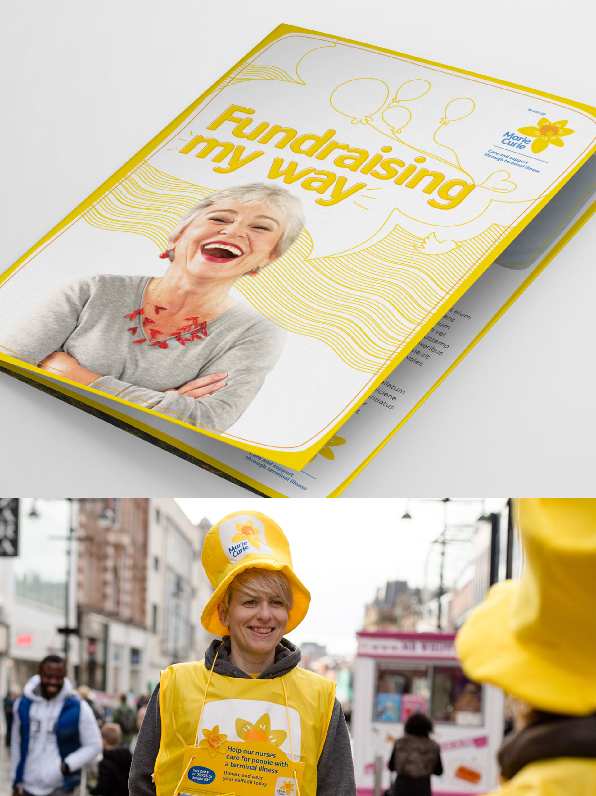
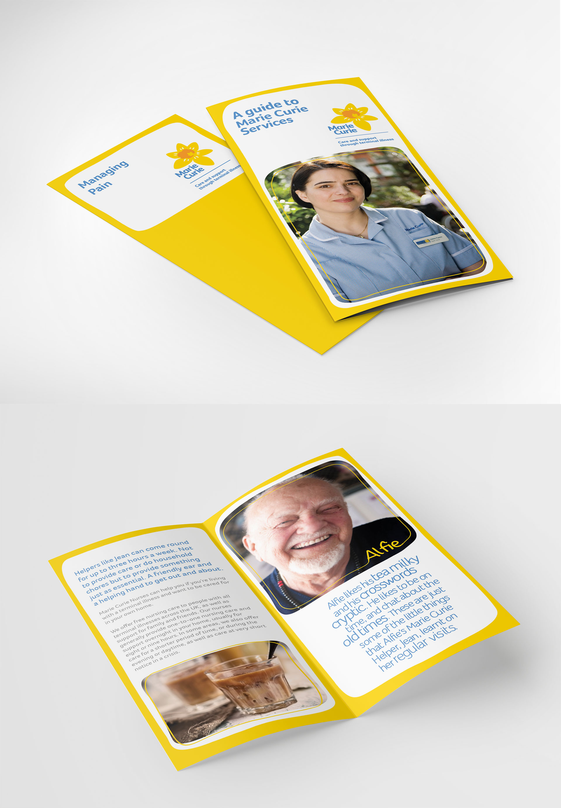
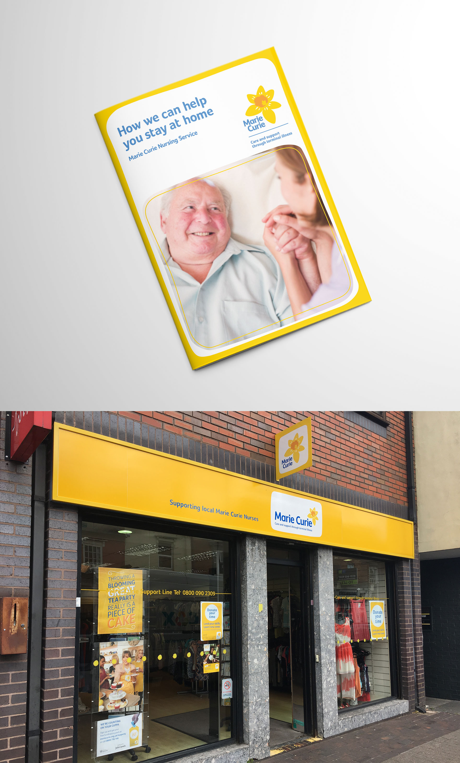
Whilst working at Arthur London, a new logo and brand voice was designed to achieve maximum impact in a busy charity sector. The hand drawn daffodil was inspired by the daffodil pictures of their service users and hospice visitors and has been upweighted to represent positivity, hope and openness. A series of design experiments were performed, with each step refined through rigorous user testing feedback. A yellow world was then created via the bold use of yellow and hand drawn illustrations that had the ability to flex across the entire brand.
Marie Curie
Whilst at Arthur London, a new logo and brand voice was designed to achieve maximum impact in a busy charity sector. The hand drawn daffodil was inspired by the daffodil pictures of their service users and hospice visitors and has been upweighted to represent positivity, hope and openness. A series of design experiments were performed, with each step refined through rigorous user testing feedback. A yellow world was then created via the bold use of yellow and supporting hand drawn illustrations that had the ability to flex across the entire brand.
- Client:
- Categories:
- Share the love: